.svg)
OKR Dashboards: The Complete Guide to Goal Tracking
.svg)
0
min. read

Updated on:
February 27, 2026
Prefer Teamflect as your HR source on Google
.svg)
An OKR dashboard turns strategy into a clear map of progress. When teams see how their work fits the big picture, they align. This transparency also boosts morale; for example, a study of 12,000 goals found that employees who shared their wins on a public dashboard were 59% more likely to report a positive mood, which directly increased lead generation.
This guide provides everything you need to build a tracking system that drives both performance and morale.
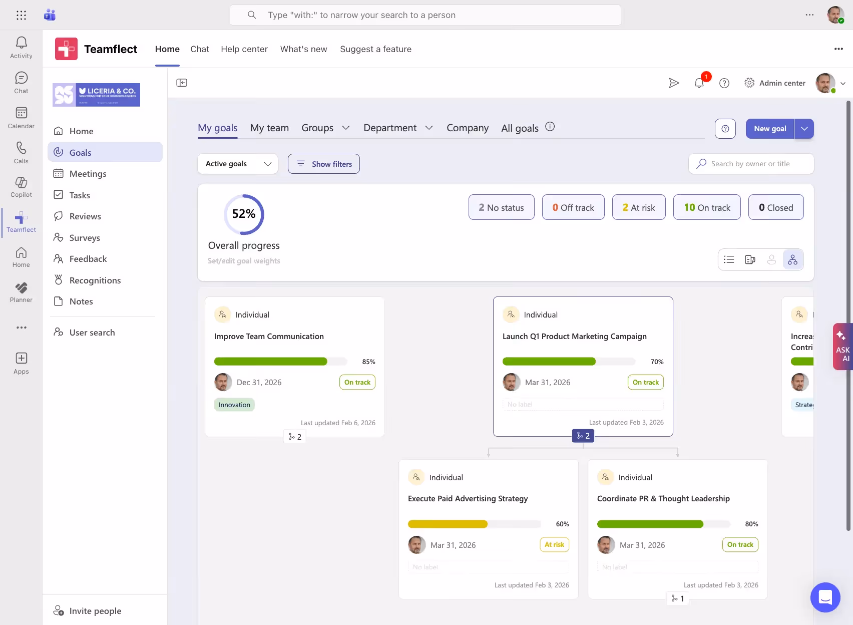
An OKR dashboard is a real-time visualization tool that tracks Objectives and Key Results across company, team, and individual levels. Rather than hunting through spreadsheets or waiting for a status meeting, everyone can see at a glance how goals are progressing, who owns what, and where attention is needed most.
OKR dashboards are central to any serious OKR software setup. They bring structure to what can otherwise be a scattered, hard-to-follow goal-tracking process. Whether you are running a quarterly planning cycle or monitoring weekly progress, a well-built dashboard keeps the whole picture visible.
Most OKR dashboards include the following core components:
Most teams already have goals. The problem is making those goals visible, connected, and consistently acted on. OKR dashboards solve that problem by turning static goal documents into living, trackable records. Below are the core reasons organizations invest in OKR visualization tools.
When OKRs live in a shared dashboard, there is no guessing about priorities. Every team member, manager, and executive can see the same information, which removes the ambiguity that tends to build up when goals are buried in documents or communicated only in quarterly all-hands meetings. Goal progress visibility becomes a shared, ongoing experience rather than a periodic announcement.
Manual status reports take time to prepare and are often outdated by the time anyone reads them. A dashboard connected to live data changes that. Teams can see current progress without waiting for a weekly update email, and leaders can spot slipping key results before they become serious problems. Real-time OKR tracking is one of the clearest operational advantages of moving away from spreadsheet-based goal management.
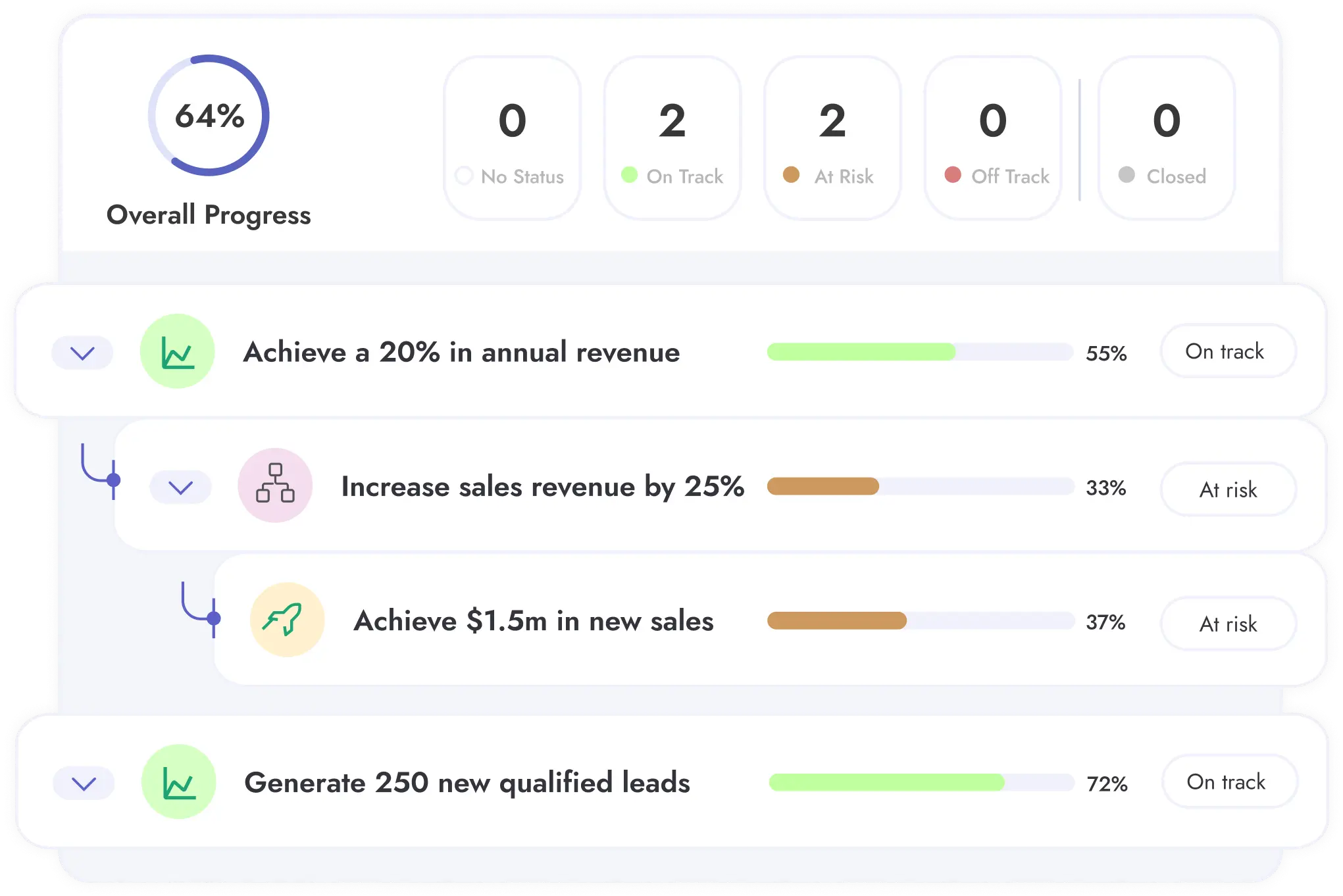
One of the most common criticisms of OKR programs is that individual contributors do not always understand how their work connects to broader company priorities. A cascading dashboard view addresses this directly. When employees can see how their personal key results roll up into team objectives, which in turn support company-wide goals, the connection between daily work and organizational strategy becomes clear.
Public visibility creates accountability in a way that private goal-setting cannot. When key results are assigned to named owners and displayed on a shared dashboard, follow-through improves. Teams are less likely to let objectives drift when you progress, or lack of it, is visible to colleagues and leadership alike.
Strong OKR dashboards do more than show current status. They reveal patterns over time, highlight which objectives consistently fall short, and surface bottlenecks that might otherwise go unnoticed. Leaders who use dashboards for performance visualization are better positioned to make resource decisions based on evidence rather than instinct.
Not all OKR dashboards are built the same. A well-designed one does far more than display a list of team goals with colored labels. The table below outlines the features that separate genuinely useful dashboards from glorified spreadsheets.
Outcome tracking and metric monitoring should both be built into the dashboard experience, not treated as add-ons. If a dashboard requires significant manual effort to stay current, adoption will suffer.
Different audiences need different views. An executive does not need the same level of detail as a team lead, and a project-specific dashboard looks quite different from a company-wide overview. Below are the main dashboard types and when each one makes sense.
This is the highest-level view, designed for executives and senior leadership. It shows the organization's top objectives, overall health scores, and progress across departments. Think of it as a strategic overview that answers one question: are we on track as a company?
Department-specific dashboards focus on the objectives that belong to a single team, such as Marketing, Engineering, or Customer Success. Team leads use these views to monitor progress within their area, identify blockers early, and stay aligned with adjacent teams.
Individual contributors benefit from a focused view that shows their own objectives, the key results they own, and how their work connects to broader team goals. This view supports employee engagement by making individual contributions tangible and visible.
A cascading OKR view maps the full hierarchy of goals, from company-level objectives down through teams and individuals. It is particularly useful for identifying misalignment, spotting dependencies, and showing where one team's key result feeds into another's objective.
This view is built for communication rather than daily management. It strips out operational detail and presents a clean summary suitable for all-hands meetings, stakeholder reviews, or executive presentations. Leadership reporting is the primary use case here.
We put together an incredible set of OKR dashboard & tracking templates for you to download in a free bundle. Here are some of the templates you will find among our OKR dashboard templates.
A simple layout that includes objectives, key results, owners, and status indicators. It requires no specialized software to get started and works well for small teams or organizations running OKRs for the first time. The priority here is clarity, not complexity.
This template places multiple team objectives side by side, complete with progress bars and ownership assignments. It is ideal for cross-functional projects where several teams are working toward a shared outcome and need visibility into each other's progress.
Designed for leadership review, this template aggregates OKR scores, confidence levels, and strategic priorities into a single concise view. The goal is to give senior leaders the information they need to make decisions without requiring them to dig into team-level detail.
This template ties OKRs directly to specific initiatives, linking key results to project milestones and deliverables. It works well in organizations where strategic goals are closely connected to defined projects with clear timelines.
Building an OKR dashboard is a practical process. The steps below cover everything from writing your first objectives to setting up a review cadence.
Start by writing clear, qualitative objectives that describe what you want to achieve. For each objective, write two to five measurable key results that will confirm you have reached it. Limit the number of active objectives to keep focus. Three to five per team is a reasonable starting point for most organizations.
Each key result should be tied to a specific metric you can actually track. Avoid vanity metrics that look impressive but do not reflect real progress. If a key result cannot be measured with a number or a clear completion state, rewrite it until it can.
Evaluate your options: purpose-built OKR software, business intelligence tools, or spreadsheets. Each has trade-offs. Spreadsheets are flexible but require manual upkeep. BI tools offer powerful analytics but often require technical setup. Dedicated tools offer the right balance of structure, automation, and usability.
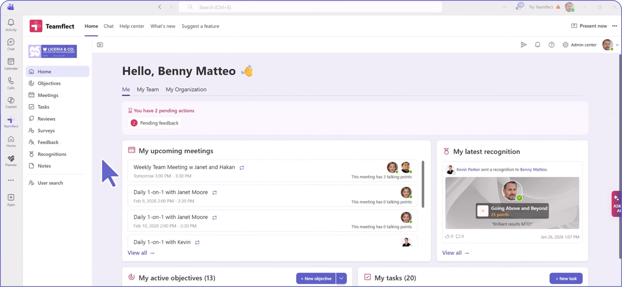
For teams already working in Microsoft 365, a tool with native Microsoft Teams integration makes the most practical sense. Teamflect, for example, runs entirely inside Teams and Outlook, which means employees do not need to learn a new platform or toggle between tools to stay on top of their goals.
Arrange your objectives, key results, owners, and status indicators in a format that is easy to scan. Use progress bars, color-coded health indicators, and clear labels. Avoid designing for comprehensiveness at the expense of readability. A dashboard that takes thirty seconds to interpret will not get used.
Manual dashboards eventually fail. Connect your tracking to live data to maintain visibility without adding administrative chores. This shift is part of a broader trend, with 87% of CHROs expecting greater AI adoption in organizational processes. Automating these updates frees your team for high-level problem-solving that requires creativity and critical thinking.
Make the dashboard accessible to all relevant stakeholders and establish a clear review cadence. Weekly pulse checks work well for fast-moving teams. Bi-weekly or monthly reviews suit larger organizations with longer planning horizons. The cadence matters less than the consistency.
Setting up a dashboard is only the beginning. The ongoing practice of reviewing and acting on what the dashboard shows is where most of the value comes from.
Decide in advance how often your team will formally review OKR progress. Weekly check-ins keep goals active and surface blockers quickly. Quarterly reviews are better suited to strategic reflection and cycle planning. Most high-performing teams combine both: a short weekly pulse and a deeper quarterly review.
Color-coded labels and progress bars allow you to assess goal health at a glance. Currently, only 14% of employees strongly agree that performance reviews inspire them to improve. Visual signals help fix this by converting complex data into instant, readable feedback. Instead of wading through dense updates, teams get the immediate clarity they need to stay motivated and adjust their efforts in real time.
Manual follow-up is one of the most common reasons OKR programs lose momentum. Automated nudges, whether for upcoming check-ins, overdue key result updates, or confidence score reviews, keep teams engaged without requiring a manager to chase updates. Good OKR management system handles this automatically.
Key results that are disconnected from daily work tend to get ignored. When you link key results to specific tasks or project milestones, progress updates can flow through naturally as work gets done. Teamflect, the ultimate performance management software built for Microsoft Teams, makes this connection easy. Teams can update OKRs, manage tasks, and hold check-in conversations all within the same platform they already use every day.
A well-designed dashboard is only as good as the habits built around it. The following practices help organizations get consistent value from their OKR dashboards over time.
Resist the urge to display everything at once. Limit the number of active objectives on any given view, and prioritize clarity over comprehensiveness. A focused dashboard that people actually use is worth far more than a comprehensive one that overwhelms and gets ignored.
Every objective displayed on the dashboard should connect back to an organizational priority. Remove goals that are outdated or no longer relevant to current strategy. A dashboard cluttered with orphaned objectives sends a confusing signal about what actually matters.
Stale data erodes trust in the dashboard and, eventually, in the OKR process itself. Automate updates wherever possible. For metrics that require manual input, assign clear ownership and set expectations about update frequency.
A number without context is easy to misread. Include targets and descriptions, so stakeholders understand why a metric matters. This clarity is essential as leaders move away from legacy productivity measures.
According to Deloitte, 74% of leaders believe it is critical to find better ways to track worker value beyond traditional output, yet only 17% feel their organizations are effective at doing so. By providing clear context, you shift the focus from simple activity tracking to the actual value created by your team.
Executives, team leads, and individual contributors need different levels of detail. A good OKR dashboard tool allows each user to see a view that is relevant to their role without being buried in data that does not apply to them. Role-based filtering is a practical feature worth prioritizing when evaluating tools.
Dashboards should spark conversation, not just observation. While 94% of employees set individual goals, SHRM found that 37% of organizations fail to flow senior leadership targets down to individuals. This gap breaks alignment.
By using tools that allow users to flag blockers and comment on results within their daily workflow, you bridge this disconnect. Keeping goals and feedback in one place ensures that individual efforts stay linked to the broader strategy.
Even well-intentioned OKR programs run into problems. Many of the most common issues trace back to how the dashboard itself is designed and maintained.
More objectives do not mean more progress. Overloading a dashboard with goals dilutes focus and makes it harder to identify what truly matters. Most frameworks recommend three to five objectives per team per cycle.
Key results must be specific and quantifiable. "Improve customer satisfaction" is too vague to track meaningfully. "Increase NPS score from 32 to 45 by end of quarter" gives teams something concrete to work toward and a clear standard for success.
A dashboard that is not updated becomes an unreliable source of truth, and once trust is lost, it tends to be abandoned. Assign accountability for keeping data current, and make regular updates part of the team's standard operating rhythm.
Too many widgets, charts, and visual elements make a dashboard harder to read, not more informative. Simpler designs get higher adoption. When in doubt, remove rather than add.
The people who use the dashboard every day will quickly identify what is working and what is not. Gathering their input and adjusting the design accordingly is not optional. A dashboard that does not serve its users will not be used.
Selecting the right tool is one of the most consequential decisions in an OKR rollout. The best tool is not necessarily the most feature-rich; it is the one your team will actually adopt and use consistently. The table below outlines the key criteria to evaluate.
For organizations standardized on Microsoft 365, choosing an OKR tool with a native Microsoft Teams integration is not just a convenience, it is a strategic decision. App-switching creates friction, and friction reduces adoption.
Teamflect is built to run inside Teams and Outlook, which means employees can manage their OKRs, hold check-in meetings, and exchange feedback without ever leaving the tools they use for everything else.
The best OKR software in the world will not help if nobody uses it. Look for tools that offer quick onboarding, pre-built templates, and dedicated implementation support. Teamflect's built-in training resources and familiar Microsoft interface make it one of the fastest platforms to get up and running, even for teams with no prior OKR experience.
Advanced dashboards should support connections to business intelligence tools like Power BI for custom OKR reporting and trend analysis. Organizations that take performance management seriously need reporting that goes beyond cycle-end snapshots.
Goal-setting is a team activity. The tools used to track goals should reflect that. Look for platforms that allow users to comment directly on key results, share meeting agendas tied to OKRs, and keep update conversations close to the goals themselves. Teamflect's integrated one-on-one meeting tool and feedback features make this kind of collaboration a natural part of the workflow rather than an afterthought.
Consider where your organization is headed, not just where it is today. Teamflect offers a free plan for up to 10 users, making it accessible for small teams getting started with OKRs. As your team grows, Teamflect's pricing plans scale accordingly, no steep jump as headcount increases.
For large organizations that need a more comprehensive rollout, Teamflect enterprise covers the full performance management stack — reviews, continuous feedback, and one-on-one meeting features, all built natively into Microsoft Teams.
The five core elements of a well-structured OKR are the objective itself, the key results that measure progress toward it, the owner responsible for each key result, the time frame within which the OKR applies, and the status or confidence score that reflects current progress. Some frameworks also include a check-in cadence as a sixth structural element, since regular review is what keeps OKRs from becoming shelf documents.
Most teams find that weekly updates strike the right balance between keeping data current and avoiding excessive overhead. For fast-moving teams or high-priority initiatives, more frequent updates may make sense. At minimum, dashboards should be reviewed and updated before each scheduled check-in meeting so that discussions are based on accurate, current information.
Yes. Tools like Teamflect are built specifically to run inside Microsoft Teams, which means you can set objectives, update key results, run check-ins, and review dashboards all within the Teams interface. For organizations already standardized on Microsoft 365, this kind of native integration removes one of the most common barriers to OKR adoption: the need to learn and maintain a separate platform.
A KPI dashboard tracks ongoing business metrics, usually operational ones, such as revenue, support ticket volume, or website traffic. These metrics tend to be persistent and measured continuously. An OKR dashboard, by contrast, is organized around specific objectives tied to a defined time period. It shows progress toward goals that have a beginning and an end, with key results that reset or evolve each cycle. The two are complementary, and many organizations use both.
Adoption comes down to two things: relevance and convenience. If the dashboard shows information that matters to team members and lives where they already work, usage follows. Start by keeping the dashboard simple and clearly connected to each person's responsibilities. Automate updates where possible to reduce the burden of manual entry. Use your OKR software's reminder and notification features to prompt regular check-ins. And involve the team in refining the dashboard design based on their feedback. People use tools that work for them.
.avif)
.svg)
.avif)
Create high-performing and engaged teams - even when people are remote - with our easy-to-use toolkit built for Microsoft Teams

_UsersMostLikelyToRecommend_Enterprise_Nps%201.svg)

.svg)
.svg)


.svg)
.svg)
.webp)